Template:Tile: Difference between revisions
SimpleArrows (talk | contribs) No edit summary |
SimpleArrows (talk | contribs) mNo edit summary |
||
| (15 intermediate revisions by 2 users not shown) | |||
| Line 1: | Line 1: | ||
<includeonly>{| class="tile" | <includeonly>{| class="tile" style="{{#if: {{{css|}}}|{{{css}}}}}{{#if: {{{float|}}}| float: {{{float}}};}}" | ||
|style="width:{{{4| | |style="width:{{{4|110}}}px; height:{{{5|110}}}px;"|[[Image:{{{1}}}|300px<!-- | ||
-->{{#if: {{{3|}}}|{{!}}link={{{3}}} }}<!-- | -->{{#if: {{{3|}}}|{{!}}link={{{3}}} }}<!-- | ||
-->{{#if: {{{crop|}}}| | -->{{!}}class=tile-image {{#if: {{{crop|}}}|img-{{{crop}}} }}]] | ||
{{#if: {{{2|}}} | |||
| {{!}}- | |||
| {{#if: {{{3|}}} | [[{{{3}}}|{{{2}}}]] | {{{2}}}}} | {{!}}{{#if: {{{3|}}} | [[{{{3}}}|{{{2}}}]] | {{{2}}}}} | ||
}} | }} | ||
|}</includeonly><noinclude> | |}</includeonly><noinclude> | ||
| Line 57: | Line 56: | ||
], | ], | ||
"default": "center" | "default": "center" | ||
}, | |||
"float": { | |||
"label": "Float", | |||
"description": "Used for positioning/aligning the tile on the page, allowing text to wrap around it.", | |||
"example": "left", | |||
"type": "string", | |||
"suggestedvalues": [ | |||
"left", | |||
"right" | |||
], | |||
"default": "none" | |||
}, | |||
"css": { | |||
"label": "CSS", | |||
"description": "An additional parameter to add any CSS to customise the individual tile.", | |||
"example": "font-size: 12px;", | |||
"type": "string" | |||
} | } | ||
}, | }, | ||
| Line 65: | Line 81: | ||
"4", | "4", | ||
"5", | "5", | ||
"crop" | "crop", | ||
"float", | |||
"css" | |||
], | ], | ||
"description": "Creates a tile with an image and caption that is resizable. Intended as a replacement for galleries with improved custom sizing and style.", | "description": "Creates a tile with an image and caption that is resizable. Intended as a replacement for galleries with improved custom sizing and style.", | ||
| Line 78: | Line 96: | ||
<br><br> | <br><br> | ||
'''Centered Tiles:''' | '''Centered Tiles:''' | ||
To create a collection of centered tiles, similar to a gallery, you can wrap the tile templates in the <nowiki><center></nowiki> tag. | To create a collection of centered tiles, similar to a gallery, you can wrap the tile templates in the <nowiki><center></nowiki> tag. | ||
'''Usage:'''<pre><center> | '''Usage:'''<pre><center> | ||
| Line 119: | Line 136: | ||
{{Tile|Min_ATV.png|Top||200|100|crop=top}} | {{Tile|Min_ATV.png|Top||200|100|crop=top}} | ||
</center> | </center> | ||
<br><br> | |||
'''Float Alignment:''' | |||
Like a thumbnail image, you can align the tile to be on the ''left'' or ''right'' of the page. This will allow any text to wrap around the tile. | |||
'''Usage:''' | |||
<pre>{{Tile|Min_ATV.png|Left||150|100|float=left}} | |||
{{Tile|Min_ATV.png|Right||150|100|float=right}}</pre> | |||
'''Output:''' | |||
{{Tile|Min_ATV.png|Left||150|100|float=left}} | |||
{{Tile|Min_ATV.png|Right||150|100|float=right}} | |||
[[Category:Block Templates]] | |||
</noinclude> | </noinclude> | ||
Latest revision as of 06:34, 28 February 2024
Creates a tile with an image and caption that is resizable. Intended as a replacement for galleries with improved custom sizing and style.
| Parameter | Description | Type | Status | |
|---|---|---|---|---|
| Image | 1 | no description
| File | required |
| Caption | 2 | Text to accompany the image. Don't place any links inside this field.
| String | suggested |
| Link | 3 | The name of the page that the image and caption should link to.
| Page name | optional |
| Width | 4 | The width of the tile's image (in pixels).
| Number | optional |
| Height | 5 | The height of the tile's image (in pixels).
| Number | optional |
| Crop | crop | Determines the position of the image when cropped to fit into its specified size. Intended for when the image has been automatically cropped into an undesired position.
| String | optional |
| Float | float | Used for positioning/aligning the tile on the page, allowing text to wrap around it.
| String | optional |
| CSS | css | An additional parameter to add any CSS to customise the individual tile.
| String | optional |
{{Tile|IMAGE|CAPTION|LINK|WIDTH|HEIGHT}}
Usage:
{{Tile|Min_ATV.png|Mining ATV||250|150}}
Output:
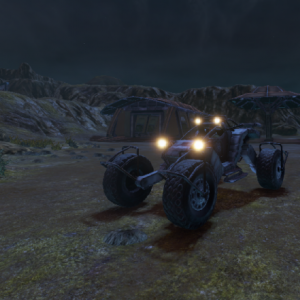
|
| Mining ATV |
Centered Tiles:
To create a collection of centered tiles, similar to a gallery, you can wrap the tile templates in the <center> tag.
Usage:
<center>
{{Tile|Min_ATV.png|Mining ATV||150|100}}
{{Tile|Min_ATV.png|Mining ATV||150|100}}
{{Tile|Min_ATV.png|Mining ATV||150|100}}
{{Tile|Min_ATV.png|Mining ATV||150|100}}
</center>
Output:

|
| Mining ATV |

|
| Mining ATV |

|
| Mining ATV |

|
| Mining ATV |
Crop Position:
If the automatic crop of a tile's image is in an undesired position, you can manually set its position through 4 values: top, bottom, left and right.
Usage:
<center>
{{Tile|Min_ATV.png|Center||50|150}}
{{Tile|Min_ATV.png|Left||50|150|crop=left}}
{{Tile|Min_ATV.png|Right||50|150|crop=right}}
{{Tile|Min_ATV.png|Center||200|100}}
{{Tile|Min_ATV.png|Bottom||200|100|crop=bottom}}
{{Tile|Min_ATV.png|Top||200|100|crop=top}}
</center>
Output:

|
| Center |

|
| Left |

|
| Right |

|
| Center |

|
| Bottom |

|
| Top |
Float Alignment:
Like a thumbnail image, you can align the tile to be on the left or right of the page. This will allow any text to wrap around the tile.
Usage:
{{Tile|Min_ATV.png|Left||150|100|float=left}}
{{Tile|Min_ATV.png|Right||150|100|float=right}}
Output:

|
| Left |

|
| Right |